
Apparel Theme - Options
In this section we explain in detail all of the options that you will find in each group on Themes > Visual Editor > Edit Settings, how they work, what they do and how their inner options affect and reflect in your store’s front-end, its functionality and visual attributes.
General Configuration
Disable Shopping features
If enabled, all shopping features of the store will deactivate and hide, like for example the following:
- the
Add to Cartbuttons on theProduct blocksand the Product page. - the
Buy it nowlinks, on theProduct blocksand the Product page. - the
Cart itemitem on the storeHeader.
Disable Product Prices
If enabled, all product prices will be hidden so customers won't be able to see them.
Enable Repeat Order (Customer Account)
Enables or disables the option for customers to repeat an order from their order's history.
Shopping Process - General Settings
The options explained next will only have an effect if you have opted to use Jumpseller’s Checkout version 1. These settings are available for some or all of the following pages: Cart, Checkout and Review Order.
Cart Logo
Allows you to upload a Logo for the Header of the shopping process pages. If not uploaded, the Store name defined at Settings > General > Preferences will be displayed.
Cart Logo Height
Allows to define the height for the Logo. We have defined a maximum height amount in order to keep a consistent design layout and avoid an excessive increase of the height of the Header.
Enable Cart Breadcrumbs
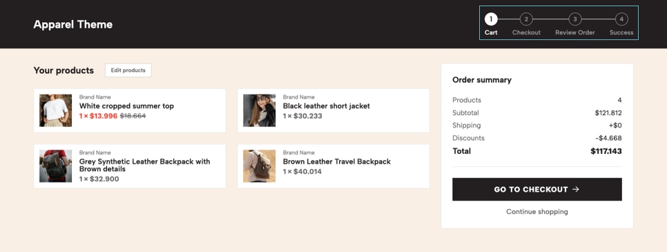
If enabled, the Breadcrumbs list will be displayed at the Header section of the shopping process pages, at the right side of the Logo. These are the 4 pages (or steps) that customers need to go through in order to complete an order. If disabled, the Logo (or store name) will align to the center of the page.
Hide Country selector
If enabled, the Country selector will be hidden from the Estimate Shipping on the Cart page and from the Shipping Address and Billing Address sections on the Checkout page.
Customize Colors
If enabled, you will be able to customize the colors with the options you see below. If not enabled, it will consider the colors defined in Themes > Visual Editor > Edit Settings > Theme Colors.
Cart Header - Background color
Background color for the Header section of the shopping process pages.
Cart Header - Texts color
Color of all the items present at the Header section of the shopping process pages.
Cart Header - Breadcrumbs Inactive Texts color
Color for inactive items present at the Breadcrumbs list of the Header section.
Cart Content - Background color
Background color for the pages of the shopping process. We suggest using a light color, near to white, so that texts can be read correctly.
Shopping Process - Payments
Some of the Payment Methods available for Jumpseller allows you to add a Description or come with a predefined text. In this section we allow you to add more customization for those texts or even replace them, like we try to explain in further detail next:
Enable Text for Automatic payment methods
If enabled (default), a custom text will be displayed for Automatic payment methods, like for example a PayPal, Stripe, Skrill, Webpay, Flow, among others.
This custom text will display at the Review Order page of your store and you can customize it at the Languages settings of your store.
Enable Text for Manual payment methods
If enabled, a custom text will be displayed for Manual payment methods, like for example a Bank Transfer, at the Checkout and Review Order pages.
This custom text will replace the Payment information details you have defined at the payment settings of each payment method of this type. You can customize this text at the Languages settings of your store.
Manual payment methods names
Here you have to define the Manual payment methods that will display the custom text by adding each name separated with asterisk (*) before the method name (unless the first), like for example:
Payment name1*Payment name 2*Payment name 3
If you leave this field empty and the previous option is enabled, all Manual payment methods will display the default text defined at the payment Payment information field.
Enable Text for External payment methods
If enabled, a custom text will be displayed for External payment methods that are added through the External Payment Gateway option at Settings > Checkout > Payments. You can customize this text at the Languages settings of your store.
Shopping Process - Shipping
So far none of the available Shipping Methods you can add to your Jumpseller store comes with a field where you can add a description for them. Therefore, until that is not implemented, this section will allow you to display texts for each shipping option, which you can modify or change at the Languages section of your store’s Administration Panel.
Enable Texts on "Estimate Shipping"
If enabled (by default), all texts you add in this section will display below each method name on the Estimate Shipping table at the Cart page.
The Estimate Shipping table and its options can be enabled or disabled by going to Settings > Checkout > Preferences. It comes enabled by default for all new stores.
"Estimate Shipping" Texts visibility
If enabled, all texts that display at the Estimate Shipping table will always be visible. If disabled (by default), only the text of the selected shipping method will be visible and the rest will be hidden, until the customer clicks on another shipping option, which will make its own text visible.
Enable Texts on "Checkout"
If enabled (by default), all texts you add in this section will display at the Shipping Options list at the Checkout page.
"Checkout" Texts visibility
If enabled (by default), all texts that display at the Checkout page will be always visible. If disabled, only the text of the selected shipping method will be visible and the rest will be hidden, until the customer clicks on the shipping option, which will make its own text visible and the rest will hide.
Enable Texts on "Review Order"
If enabled (by default), the text for the Shipping method that the customer has selected will be displayed at the Review Order page.
Shopping Process - Success Page
The Success Page is the final step of the shopping process to where your customers arrive after they successfully manage to place an order, whether it’s from manual, automatic or external payment methods.
Even when an email will be sent to all customers after they concreted a purchase, it’s important that you can provide the most relevant information you can at this page, specifically if for any case or problem, customers didn’t get the proper email.
This page is basically divided into 3 sections:
1.- The heading:
which can contain a Logo or the name of the store, a “thank you” message and other texts that can contain relevant information about the purchase and what’s going to happen next.
2.- The summary:
Which can display all the information related to the order itself, like the amount of products, the payment and shipping methods they selected, and other amounts like subtotal, shipping, discounts and total. It also contains the list of products of the order.
3-. Complete the process:
Mainly for first time customers and if you have set that customers can purchase without the need to register, a section will appear between both previous sections offering customers to create a password and repeat it, in order for their accounts to be labeled as “Registered”. If they don’t do it, their accounts will be labeled as “Guest”. The difference between these statuses are:
- Registered: customers who have managed to create an account, prior to shopping or from the Success page, will be able to access their account page to review their order history, check the status and information of each order and modify their information, such as Contact, and Shipping and Billing details. They can also add multiple Addresses for both types.
- Guest: Customers that don’t finish the process won’t be able to access an account, because in reality, it wasn’t created but the information will be there. Therefore, they can go to the Login page of the store and click on the “Reset password” link, enter the email address with which they bought and will receive an email with a link to create a password. Once they do that, they will be able to access their account page.
Here you can find all the options to customize the Success page:
Success Logo
Allows you to upload and display a Logo at the top of the Success page. If not uploaded, the store name defined at Settings > General > Preferences will be displayed.
Success Logo Height
Allows to define the height for the Logo. We have defined a maximum height of 200px in order to prevent the heading section from being too big. Without doing this and for example a Logo of 800px tall would be uploaded, the information below the heading wouldn’t be visible at first glance on the browser, which would negatively affect your store’s usability.
"Manual" payments Title and Text
If enabled (by default), an optional Title and Text for payment methods of type Manual will be displayed (e.g. Bank Transfer). Both of these can be modified at the Languages section of the store's Administration panel.
In case you didn’t know, every order or purchase that’s made at your store with a Manual payment method it’s defined with the Pending Order status. Therefore, it is expected that the customer makes the payment (mostly through a bank/wire transfer) and once you receive it and confirm it has been made and that’s effectively related to the order, you can then change its status.
So, the focus of this option is letting customers know that the order has been placed, but it is necessary to wait for the payment to be received and accepted in order to mark the order as Paid, which will trigger the Order Paid email.
Support Complementary Text
If enabled, a complementary text will be displayed at the end of the first section (heading) of the Success page with the Email defined at Settings > General > Emails > Contact email.
The focus of this text is to provide information about how customers can contact you in case they need anything. This text can be modified at the Languages section of the store's Administration panel.
Support Email
Here you can add an alternative email address in case you don't want to display the one defined at Settings > General > Emails > Contact email.
Display “Payment method”
If enabled, the “Payment method name” the customer selected when purchasing will be displayed at the Order summary section.
Display "Shipping method”
If enabled, the “Shipping method name” the customer selected when purchasing will be displayed at the Order summary section.
Display "Products quantity”
If enabled, the number of products the customer has purchased will be displayed at the Order summary section.
Display "Order Subtotal”
If enabled, the Order subtotal amount will be displayed at the Order summary section.
Display "Order Shipping”
If enabled, the Order shipping amount will be displayed at the Order summary section.
Display "Order Taxes”
If enabled, the Order taxes amount will be displayed at the Order summary section.
Display "Order discounts”
If enabled, the Order discounts amount will be displayed at the Order summary section.
Customize Colors
If enabled, you will be able to customize the colors with the options you see below. If not enabled, it will consider the colors defined in Themes > Visual Editor > Edit Settings > Theme Colors.
Success page - Background color
Success page - Texts color
Color for the texts of the page.
Success page - Links color
Color of the links of the page.
Success page - Links color (hover)
Color of the links of the page on hover state (when passing the mouse over).
Success page - Boxes background color
Color of the boxes or sections that contain information.
Success page - Boxes border color
Color for the border of the boxes or sections that contain information.
Theme Styles
These settings allow you to configure some overall styles of the theme.
Containers Maximum Width
Allows to determine how the theme containers will behave regarding the maximum width that they will have when stretching across bigger browser screens, like for example an iMac. This is what we explained in detail at the beginning of this documentation, in the Theme Basics - Store Grid section.
Theme Corners Style
Choose the corner style that elements of the theme will have. This affects elements like Slides, Banners, Images, Product blocks, Accordions, among others. You can choose that elements have a slightly rounded corner or to be fully square. This will depend on the look you want for your store.
Example of how option Theme Corners Style affects images, in this case Banners
First image: Corners Style: Square | Last image: Corners Style: Rounded
Theme Buttons Style
Choose which style of button you would like to use in the store. This affects most of the buttons of the store.
There will be some buttons that won’t apply the Circular option. This is intentional because they wouldn’t look right at all, considering the specific purposes they have and context where they are present.
You can find a table with examples for how buttons look further down this page, at the Theme Colors section.
Add to Cart Button format
Allows to define the format for the text of the Add to Cart buttons of the store. An example would be as follows:
- Lowercase >
Add to Cart - Uppercase >
ADD TO CART
Lowercase text intentionally, in order to prioritize the hierarchy of other elements around them.Add to Cart Button Icon
Allows you to select the icon for the Add to Cart button that's available in Product blocks and at the Product page. If you choose None, these buttons will only display their respective text.
You can find a table with each type of icon and their respective styles.
Add to Cart Button Icon style
Allows you to define the style of the icon you have selected in the previous option. You can see examples of how icons can look depending on the selected style at the following table:
| Style / Icon | Shopping Bag (default) | Shopping Basket | Shopping Bags | Shopping Cart |
|---|---|---|---|---|
| Duotone | ||||
| Light | ||||
| Regular (default) | ||||
| Sharp | ||||
| Solid | ||||
| Thin |
Theme Colors
Here you can find and adapt all the colors related to the theme. The colors for the theme have been defined in groups, which aim to be used for the specific purposes their names have. If you want to have a bit more context on how the colors of this section interact with your theme, you can read the respective section at Theme Basics.
Next are all the general color options you can customize in your theme:
Main Colors
Are the ones that are gonna be used most often in the theme.
Main Color 1
Color used mostly in titles and certain elements of main relevance in the store. It’s also used in some backgrounds for certain sections, commonly with an applied soft opacity.
Main Color 2
Color used mostly in subtitles, texts, descriptions and certain elements of secondary relevance in the store.
Secondary Colors
Are the ones that are applied to certain details of the store.
Secondary Color 1
You can find this color be used in certain sections, details and elements of the store like backgrounds.
Secondary Color 2
You can find this color be used in certain sections, details and elements of the store like backgrounds.
Secondary Color 3
You can find this color be used in certain sections, details and elements of the store like backgrounds.
Complementary Colors
These colors are applied to certain elements within specific use cases.
Prices Color
Color used for all the elements that relate to a price in the store, except when it has a visible discount.
Discount Color
Color used for all the elements that relate to a discount in the store, like for example:
- A price that has a discount applied.
- For the discount label that can be enabled to be displayed on product blocks.
- For the text “Save x% on this product” on the product page.
Store Background Color
Background color of the store. By default is white. This color won’t be applied for the Shopping Process pages, because they have their own color that can be modified if you feel the need to.
Colors Table
Here you can find all the colors applied and be able to copy the values to your clipboard:
| Color | Sample | RGB value | HEX Value |
|---|---|---|---|
| Main Color 1 | |||
| Main Color 2 | |||
| Secondary Color 1 | |||
| Secondary Color 2 | |||
| Secondary Color 3 | |||
| Prices Color | |||
| Discounts Color | |||
| Ratings Color | |||
| Store Background Color |
Main Button
The colors detailed here apply to the Add to Cart button, as well as for some other buttons of greater relevance in theme.
Main Button > Text Color
Color for the text. By default is White.
Main Button > Text Color (hover)
Color for the text on hover state (when passing the mouse over the button). By default is White.
Main Button > Background Color
Color of the background. By default it uses the Main color 1.
Main Button > Background Color (hover)
Color of the background on hover state (when passing the mouse over the button). By default it uses a darker version of the Main color 1.
Secondary Button
The colors detailed here apply for some secondary relevance buttons or ones that accompany the Main button.
Secondary Button > Text Color
Color for the text. By default is White.
Secondary Button > Text Color (hover)
Color for the text on hover state (when passing the mouse over the button). By default is White.
Secondary Button > Background Color
Color of the background. By default it uses the Secondary Color 1.
Secondary Button > Background Color (hover)
Color of the background on hover state (when passing the mouse over the button). By default it uses a darker variation of the Secondary Color 1.
Tertiary Button
This button is the one that is used less in the theme and you can see it primarily used for the products that have status of Not available or Out of Stock.
Tertiary Button > Text Color
Color for the text. By default it uses the Secondary Color 1.
Tertiary Button > Text Color (hover)
Color for the text on hover state (when passing the mouse over the button). By default it uses a darker variation of the Secondary Color 1.
Tertiary Button > Background Color
Color of the background. By default it uses the Secondary Color 2.
Tertiary Button > Background Color (hover)
Color of the background of the "Tertiary Button" on hover state (when passing the mouse over the button). By default it uses the Secondary Color 3.
Buttons Table
Here you can find a few examples on how these buttons look with different style configurations:
| Button | Rectangular | Rounded | Circular |
|---|---|---|---|
| Main Button | |||
| Secondary Button | |||
| Tertiary Button | |||
| Add to Cart Button |
Theme Fonts
These settings allow you to choose the Fonts of the theme. This is connected to the Google Fonts API, so you can choose any of the available fonts of the list or type and look for the one you want.
Main Font
Choose the Font that will be used as the Main one of your store. This will be used mostly on Titles and certain subtitles, like for example the following:
- All Titles, Subtitles and links for store
Components. - All titles for the categories, product and pages.
- The name for products on the
product blocksview. - The title of the
Blog articles.
Secondary Font
Choose which font will be used as the Secondary of your store. This will be used mostly on the following elements:
- Descriptions for store
Components. - Descriptions for the categories, product and pages.
- Body/Content for the pages with any
page template. - All products and store
prices. - Some other elements of secondary relevance.
Buttons Font
Choose which font will be applied to all buttons of the theme.
Theme Header
These settings allow you to customize the Header of the theme. As it was explained at the beginning of this document, the Header is one of the most important -if not the most important- elements of your store, because it’s the section that will allow your customers to navigate through your store.
Next you can find the full set of options that will allow you to customize the Header of your store:
Width
This option allows you to define the width of the content of the Header, based on two options:
Full Width
The width of the section takes 100% the browser's width.
Grid Width
The width of the section aligns with the maximum width that the store container grid has.
This will define the width of the content, but keep in mind that the width of the Header will always be 100% of the browser’s width. You will be able to notice this as you scroll down the page and realize that the Header’s background color covers and places on top of the content that’s behind it.
Header Fixed
Allows to fix the Header at the top of the browser, in order to follow users as they scroll down through the store. We recommend you don’t disable this option because if you do, it will be harder for customers to navigate your store as they will have to scroll all the way up to see or find the Header again, especially on Mobile devices.
Header Logo
Logo ideally in .svg format (vector). If not, we recommend that you upload it in .png format (with transparency).
If not uploaded, the one you add at Settings > General > Preferences > Store Logo will be displayed. Ultimately, if no logos exist, the Store name will show.
Header Logo Height
Allows to define the height for the Logo, with a maximum amount of 120px. This has been set up like this so it doesn’t make the Header too big.
Header Logo > Mobile version
Optional. Logo that displays in Mobile devices that has a width less or equal than 575px. If not uploaded, Header Logo will be displayed for all devices.
Header Logo > Mobile Height
Allows to define the height of the Logo for Mobile devices.
Enable Header Login item
Allows to show or hide the Login/Register item that takes customers to the respective page of your store.
Customer Login overall setting disabled, even if you have this option enabled (by default) the item will not be visible. You can enable the overall setting at Settings > General > Preferences > Customer Login.Login/Register item from the Header, customers will still be able to access it when they get to the Checkout page of the store, because there will be a message there that will offer it.Header Login Icon
Allows you to select the icon of the Login item in the Header of the store.
Header Login Icon Style
Allows you to define the style of the Header Login icon you have selected before.
Header Cart Icon
Allows you to select the icon of the Cart item in the Header of the store.
Header Cart Icon Style
Allows you to define the style of the Header Cart icon you have selected before.
Header Menu Icon Style
Allows you to define the style of the Menu icon that's visible in the Header of your store for Mobile devices.
Header Submenus Style
Allows you to select the style that Submenus will have for items that contain more levels inside. This only works for Desktop devices. The Submenus for the Desktop navigation menu can be displayed in two different ways, which we explain here:
Flyout
This is the typical Submenu style you can find at most stores, which presents a vertical list of items. Each of those items can also have submenu's inside, which will display at the right side of the name. This option will display a maximum of 4 levels.
Mega
This Submenu style generates a bigger section and allows for lists to be displayed within columns. The are conditions for this Submenu to work, which we list here next:
- The width of the
Submenuwill depend on the amount of items (or lists) it has, based on the following amounts:- If there's only one 2nd-level item, it will have a width of 200px.
- If there are only two 2nd-level items, it will have a width of 400px with two columns, one for each item.
- If there are 3, 5, 6, 7 or 8 2nd-level items, it will have a width of 600px and columns will adapt to the available space.
- If there are 3 items, it will consist of one row with three columns.
- If there are 5 items, it will consist of two rows: The first with 3 columns and the second with the remaining two.
- If there are 6 items, it will consist of two rows with 3 columns each.
- If there are 7 items, it will consist of two rows: The first with 4 columns while the second with just 3 columns.
- If there are 8 items, it will consist of two rows, with 4 columns each.
- If there are 4 2nd-level items, it will have a width of 700px and they will be in 4 columns, one for each item.
- If there are 9 or 10 2nd-level items, it will have a minimum width of 800px and columns will adapt this way:
- If there are 9 2nd-level items, it will consist of two rows: The first one with 5 columns while the second one with 4 columns.
- If there are 10 2nd-level items, it will consist of two rows, with 5 columns each.
- It allows a maximum of 3 levels to be displayed.
- The second-level items will work as the titles of each list and a “View all” link will be displayed at the end of the list in order to access it.
For any of these types of Submenus styles, we suggest taking a good look at the way you create your categories and how you organize them. If the available levels don't exactly fit your needs, you can always opt for solutions such as Filters, which are available on some of Jumpseller’s plans.
Theme Header - Colors
The following options allow you to customize the colors for the Header of your theme.
Customize Header Colors
If enabled, you will be able to customize colors with the options you'll find below. If not enabled, it will consider the colors defined in Themes > Visual Editor > Edit Settings > Theme Colors.
Background color
Background color of the Header. By default this is white.
Texts color
Color for all the items available in the Header.
Texts color (hover)
Color for all the items available in the Header on hover state (when passing the mouse over).
Enable Header border
Applies a border at the bottom part of the Header in order to create a visual division with the content of the store.
Header border color
Color of the border of the Header.
Submenu Background color
Background color for the Submenus. It applies to any type of submenus.
Submenu border color
Color for the border of the Submenus and the border that separates each item.
Submenu Links color
Color for the links of the Submenus.
Submenu Links color (hover & active)
Color for the links of the Submenus in hover state (when passing the mouse over). Also applies for active links.
Submenu Links background color (hover & active)
Color for the Link's background on hover and active state. Only applies if Header Submenus Style is equal to Flyout.
Submenu Titles color
Color for the titles of the Submenus. Only applies if Header Submenus Style is equal to Mega.
Theme Footer
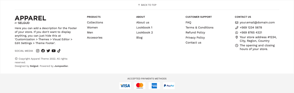
These settings allow you to customize the Footer, which is the section that is positioned at the very end of all pages of the store.
The Footer of the theme is divided into two big sections that contain different subsections with elements that can be enabled or not, depending on the amount of information you want to display:
Main section
This section contains the following elements: Logo, Description, Social Media links and Copyright information. You will be able to see it on the left side of the Footer for Desktop devices and will be the first section visible for Mobile devices. It also includes an Scroll link that can be enabled as well.
Menus section
This section can contain different types of menus or lists, that can display links to different pages of the store as well as contact/store information. It can also include the Social Media links if you think they would look better in a list display.
The options available to customize the Footer of your store are the following:
Footer Style
Style of the Footer for Mobile devices:
Compact
It will display only the Main section, while the Menus section will hide. This is useful if you want your Footer to not be so tall or large on Mobile devices.
Full
All sections will be visible (if enabled) for both Mobile and Desktop devices.
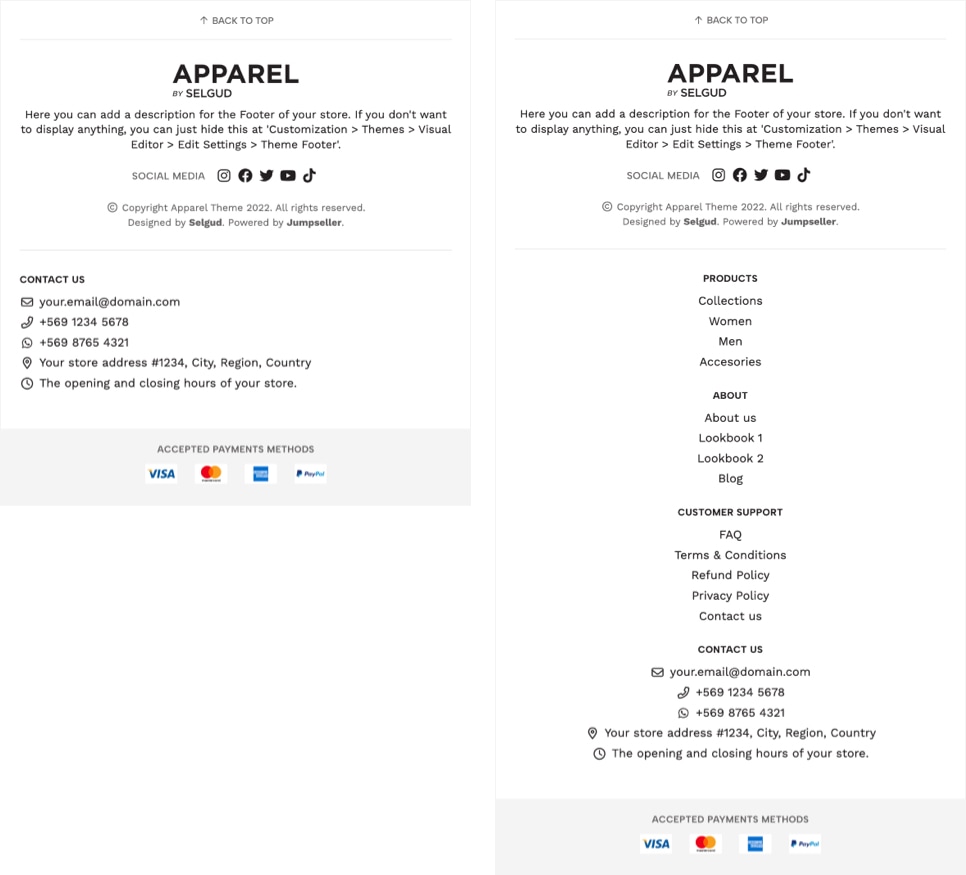
Left image: Compact | Right image: Full
Footer Scroll Link
Allows to enable a Scroll link at the start of the Footer so customers can easily go to the top of the page. You can edit the text of this link at the Languages settings of your store.
Enable Main Section
Allows to show or hide the Main Section entirely. Therefore, if at the Footer Style option you select Compact, we recommend not disabling this option as it would look strange because the Menus would also be hidden.
Display Footer Branding
Allows to define if the Logo or Store name will be displayed, even when any of those are available.
Footer Logo
Logo ideally in .svg format (vector). If not, we recommend that you upload it in .png format (with transparency).
If not uploaded, the one you add at Settings > General > Preferences > Store Logo will be displayed. Ultimately, if none of the logos are uploaded, the Store name will be displayed.
Footer Logo Height
Allows to define the height of the Logo. This would apply to any of the logos you upload.
Enable Footer Description
Allows to display the store description defined in Settings > General > Preferences > Store Description.
Custom Footer Description
Allows to add a different description than the one defined in Settings > General > Preferences > Store Description.
Enable Navigation Menus
Allows to display any of the menu lists added in Customization > Navigation > Footer Menus, as long as at least one of them has inner items or a so-called “dropdown”.
Enable Social Networks
Allows to show the list of Social Networks links of the store in the Footer.
Social Networks position
Allows to define the position in which Social Networks will appear:
- Main section: They will be placed below the
FooterLogo and Description. - Menus section: They will be placed along with the Menus and within a list style, at the right side of the
Footer.
Social Networks Title
Title that will display along with the list of Social Networks.
Enable Contact Information
Allows to show the list of Contact Information details of the store in the Footer from Themes > Visual Editor > Edit Settings > Store Information.
Contact Information Title
Title that will display along with the list of Contact Information details.
Theme Footer - Payment Methods
These settings allow you to add and display several predefined Payment Methods logos at the Footer of your store.
Show Payment Methods in the Footer
If enabled, all of the Payment methods you enable below will be displayed in the Footer of your store.
Payment Methods Title
Allows to show or hide the title of the section. You can change it at the Languages settings of your store.
Content Alignment
Allows to define the alignment of the content of the section (title and logos).
Customize Footer Payments Colors
If enabled, you will be able to customize colors with the options you'll find below. If not enabled, it will consider the colors defined in Themes > Visual Editor > Edit Settings > Theme Colors.
Background color
Background color of the section.
Title color
Color for the title of the section, if enabled.
Payment Logos
List of available payment methods logos to be displayed:
| Payment Method | Logo |
|---|---|
| Webpay |  |
| Chek |  |
| Khipu |  |
| Servipag |  |
| Mach |  |
| Flow |  |
| Caja Vecina |  |
| Klap |  |
| PSE |  |
| Baloto |  |
| ePayco |  |
| Efecty |  |
| Oxxo |  |
| MercadoPago |  |
| Multibanco |  |
| MBWay |  |
| PayU |  |
| iDEAL |  |
| Skrill |  |
| Stripe |  |
| Apple Pay |  |
| Bitcoin |  |
| Visa |  |
| Mastercard |  |
| American Express |  |
| PayPal |  |
| Diners Club |  |
| Wire Transfer |  |
| Manual Payment |  |
Theme Custom Codes
Allows to add any custom code you need to place in certain sections of the theme code. This is useful for any plugins and/or tools you wish to install, like for example Pop-ups, Google Analytics, Google Tag Manager codes and other scripts you might find necessary.
Top Head custom code
In this field you can copy/paste any code that must go at the very start of the opening head tag of your store.
Bottom Head custom code
In this field you can copy/paste any code that must go before the end of the head tag of your store.
Top Body custom code
In this field you can copy/paste any code that must go at the very start of the opening body tag of your store.
Bottom Body custom code
In this field you can copy/paste any code that must go before the end of the body tag of your store.
Mobile Menu
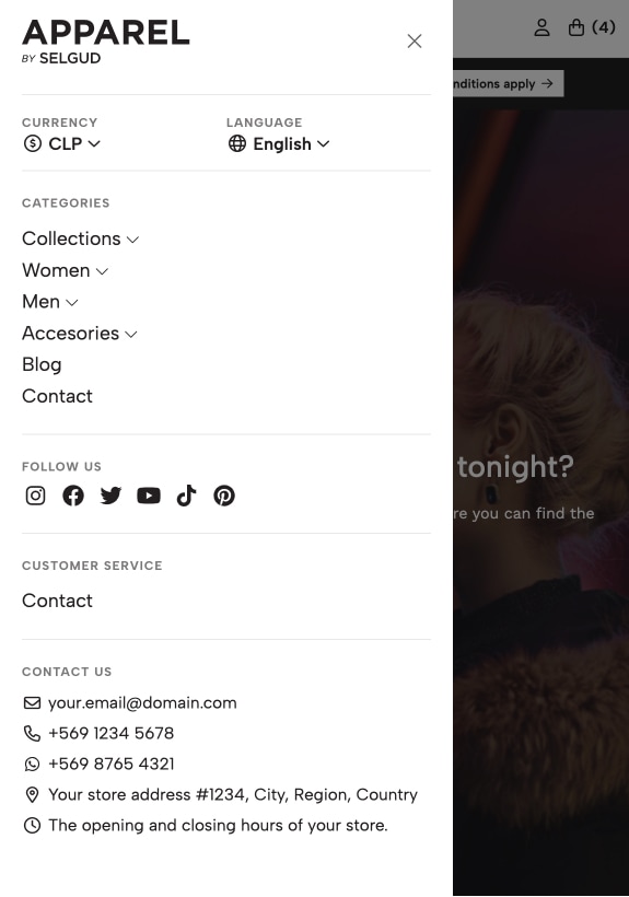
Mobile Menu and all of it's possible sections, which is available to be displayed on Mobile devices.The Mobile Menu as it was explained briefly at the beginning of this documentation, is the one that's visible and accessible from Mobile devices. Must be said that it can be accessed as well on Tablet devices and on some Desktop devices that have a small resolution or if the browser window has been reduced in its size, which will make the “Menu” item appear.
Regarding the content that this element displays, we could divide it into 6 available sections that have different purposes and elements contained, which we will explain next:
Heading
The heading section is the one that’s placed at the very top of the Mobile Menu and presents the following elements:
- Logo, which will be conditioned based on what you choose:
- Display a specific
Logothat you can upload to theMobile Menu. - If the previous wasn’t uploaded, it will display the
Logoyou uploaded at Settings > General > Preferences > Store Logo. - If none of the previous Logos were defined, the
Store namewill be displayed.
- Display a specific
- The close icon, that will allow customers to close the sidebar. They can also close it by clicking outside of it when there’s space available.
Toolbar
The toolbar can display the following elements in this order as long as at least one of them meet the necessary conditions:
- The Currencies dropdown, if there are two or more currencies added in the store.
- The Languages dropdown, if there are two or more languages added in the store.
The Main menu
It will display the same Menu that’s visible for Desktop devices at the Header of your store, which contains all the items you added at Customization > Navigation > Main Menu. This menu will work as an “Accordion”, meaning that:
- If an item contains sub-items inside, it will appear closed and it will only display the inner list on click. This works the same way if inner items also have sub-items.
- If an item doesn’t have sub-items, it will work as a “normal” link.
Social Media
You can choose to enable all Social Media links you have added at Settings > General > Preferences > Business Information > Social Media. Only the icons for each one will be displayed.
The Secondary Menu
The menu available at Customization > Navigation > Secondary Menu can be displayed only on this element. It can be used to publish relevant links or content, like for example links to pages that are also available at the Footer of your store, in case you have defined its style as Compact.
Contact information
You can display all the contact details you have added at Themes > Visual Editor > Edit Settings > Store Information.
Here are all the options available for this section:
Mobile Menu Logo
You can upload a Logo that displays at the top of the Mobile Menu. We suggest uploading the Logo in .svg format or ultimately in .png format with transparency.
Mobile Menu Logo Height
Allows to define the height for the Logo. This height will apply for any logo that displays here, except the Store name.
Main Menu - Title
Title of the Main Menu section. If you don't want this title to appear just leave the field empty.
Enable Social Networks
Enable the Social Media icons below the main menu inside the Mobile Menu. All Social Media links you enable at Settings > General > Preferences > Business Information > Social Media will be displayed, except Whatsapp, which will be available to be displayed at the Contact Information section below.
Social Networks - Title
Title of the Social Networks section. If you don't want this title to appear just leave the field empty.
Enable Secondary Menu
Enables the Secondary Menu which is available to use in Customization > Navigation > Secondary Menu.
Secondary Menu - Title
Title of the Secondary Menu section. If you don't want this title to appear just leave the field empty.
Enable Contact Information
Allows to enable the list of Contact Information details available in Themes > Visual Editor > Edit Settings > Store Information like email, phone, etc.
Contact Information - Title
Title of the Contact Information section. If you don't want this title to appear just leave the field empty.
Store Message
This section allows to display a full-page section that blocks the store front-end, preventing customers from seeing any content and shopping. This can be useful if you want to disable your store for a period of time, like for example if you’re going on vacation or need to do some new implementations to it.
Enable Store Message
It enables the store message to be displayed.
Logo
Allows to display a Logo in the message. We suggest not uploading something too big and ideally in .svg or .jpg format.
Title
Main Title of the section.
Text
Text that goes below the title, to give more context about what the message is about.
Enable Social Networks
Allows to display the list of Social Networks (e.g. Instagram, Facebook) added to the store in Settings > General > Preferences > Business Information > Social Media.
Enable Contact Information
Allows to display the list of Contact Information details (e.g. Email, Address) added to the store in Themes > Visual Editor > Edit Settings > Store Information.
Customize Colors
If enabled, you will be able to customize colors with the options you'll find below. If not enabled, it will consider the colors defined in Themes > Visual Editor > Edit Settings > Theme Colors.
Background Color
Background color for the message.
Content Color
Color for the Title, Subtitles and Text.
Links Color
Color that’s applied to all links like for example the email or social media links, if added.
Content Color > Hover
Color for links on hover state (when passing the mouse over).
Store Information
These settings allow you to publish contact details or information about your store. These options display in several sections like the Footer, Mobile Menu, Contact page, among others.
Contact Email(s)
Email(s) will be clickable links that will open the customer’s email software (desktop) or application (mobile).
Phone(s)
Phone(s) will be clickable links that will open the customer’s application that allows them to make calls. This would probably be used mostly on mobile devices or for example in Mac computers with the ability to make calls through Facetime.
Enable Whatsapp
Allows to enable and display the Whatsapp number defined at Settings > General > Preferences > Business Information > Social Media.
Main Address
You can add your store's Main address here.
Link to Google Maps
If you need your store's Main Address to be a link to Google Maps, copy and paste the link here. This will open Google Maps in a new browser tab.
Business Hours
You can add here the days and hours your store is open for business.
Store Search
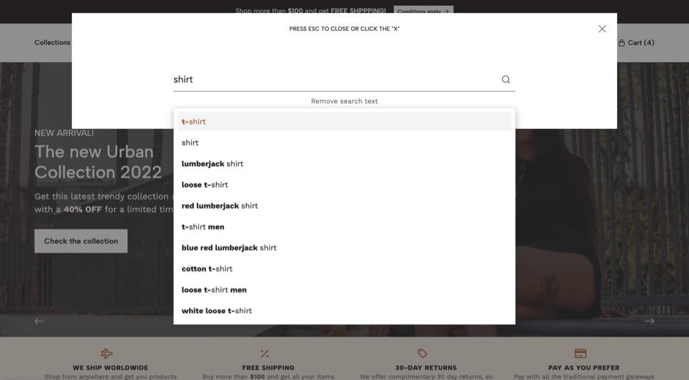
These settings allow you to enable (or disable) all the search related features of your store. When clicking the Search icon that’s available at the Header of your store, a modal box will open (also known as Pop Up) with the respective search field, among other elements.
Enable Store Search
Allows to enable or disable all the functionalities related to search in the store. This will hide the Search item from the Header of the store, therefore, customers won’t be able to search for products anywhere else.
Search Text
Placeholder text that displays in the search input. This text is useful to give a hint for what customers can search for.
Search Icon Style
Allows to define the style of the Search icon that's visible in the Header of your store.
Enable Search Categories
Allows to display a list of items below the search input/field, to allow customers to search within certain topics, words, parameters, etc. These can be categories, products, filters, pages or whatever you need.
For this section to be displayed, you need to add at least one item in Customization > Navigation > Search Menu.
Search Categories > Title
Here you can define the title that will appear before the list of items.
Customize Colors
If enabled, you will be able to customize colors with the options you'll find below. If not enabled, it will consider the colors defined in Themes > Visual Editor > Edit Settings > Theme Colors.
Background Color
Background color of the search modal window.
Texts Color
Color for the texts of the search modal window.
Search field text color
Color for the text of the search input field.
Search field text color (focus/filled)
Color for the text of the search input field on focus state and/or when the customer has already typed something in it.
Search field background color
Background color of the search field.
Search field border color
Color of the border for the search field.
Search field border color (focus)
Color of the border for the search input field on focus state.
Search button color
Color of the button (arrow) of the search modal window.
Search button color (hover)
Color of the button (arrow) of the search modal window on hover state (when passing the mouse over).
Search Categories items > Text color
Color for the texts for each Search Categories item.
Search Categories items > Text color (hover)
Color for the texts for each Search Categories item on hover state (when passing the mouse over).
Search Categories items > Border color
Color of the border for each Search Categories item.
Search Categories items > Border color (hover)
Color of the border for each Search Categories item on hover state (when passing the mouse over).
Store Whatsapp
Here you can add and customize a Whatsapp button that follows customers as they navigate your store. In order for this to work, you need to add your Whatsapp number at Settings > General > Preferences > Business Information > Social Media.
Enable Whatsapp Button
Enables the Whatsapp button on all store pages. We recommend not enabling this feature if you're gonna use a plugin or integration that will also display a button.
Enable on Product Page
Allows to display the Whatsapp button in the message that appears for products that have a status of "Not available” or “Out of Stock”. This button will display below the Contact us button, if enabled as well. You can modify the text of the button at the Languages settings of your store.
Button position
Allows to select the position of the button, which will always be in one of the corners of the browser.
Customize colors
If enabled, you will be able to customize colors with the options you'll find below. If not enabled, it will consider the original Whatsapp brand colors
Background color
Allows you to customize the background color of the button.
Background color (hover)
Background color on hover status (when passing the mouse over).
Icon & Text color
Color of the icon (logo) of the button. If the button is enabled in product pages, this color will apply to the entire text of the button: “Send us a message”.
Add to Cart Notification
This notification displays when adding products to cart, if there's at least one product already in it. For a better understanding of how this works let’s look at a few examples:
Case 1
A customer has just arrived at the store and adds a product to the Cart. When this happens the notification won’t display because what will be shown is the Sidebar Cart panel that appears from the right side of the browser. This functionality has been defined to work this way in order to let customers know that this element exists and they can access it in order to perform certain actions:
- Edit products they have added
- Go to the Checkout page
- Go to the Cart page
- Review the
totals, like subtotal, shipping, discounts and total.
The Sidebar Cart panel also displays some messages related to features like “Minimum purchase conditions” or “Amount left for Free Shipping”, which you can read about further down this documentation.
Case 2
A customer has been in your store for a while and has already added 1 product to the cart. The next product (or products) that are added will trigger this notification on the corner you define it appears, informing the quantity and name of the product. This notification will trigger each time a product has been added. The Sidebar Cart panel will still be accessible and can be opened by clicking on the Cart item available at the Header of the store.
The available options for you to customize notifications are the following:
Enable Add to Cart Notifications
If enabled (default), a message will be displayed at the right side of the browser to notify customers that a product has been added to cart.
Cart item of the Header, as well as inside the Sidebar Cart panel, but customers won’t be visually notified when a product has been added.Notification Position
Allows to select if the notification will be displayed at the top or bottom of the browser, on the right side.
Customize Colors
If enabled, you will be able to customize colors with the options you'll find below. If not enabled, it will consider the colors defined in Themes > Visual Editor > Edit Settings > Theme Colors.
Notification Background Color
Background color for the notification.
Notification Text Color
Color for the texts inside the notification.
Notification Link > Text Color
Color for the link that allows customers to go to the Cart page of the store.
Notification Link > Text Color (hover)
Color for the link in hover state (when passing the mouse).
Notification Link > Background color
Background color of the link.
Notification Progress bar color
Color for the progress bar of the notification that reduces its size based on the time that’s left before the notification closes.
Informative Slider
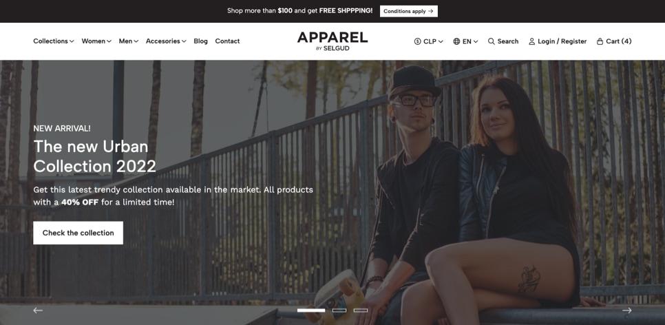
The Informative Slider is a section that allows you to display content and information about your store. Sections like this one can be seen in most of Ecommerce sites with messages related to content like for example:
- An “X” amount that customers need to add to cart to get Free Shipping.
- Special offers or discounts.
- Information about new stores opening.
- Information regarding working days or hours where the store won’t be available.
This section always works as a Carousel and allows you to add up to 4 Slides in it. The available options for you to customize it are the following:
Slider display
Choose where the Informative Slider will be displayed, based on the following options:
- Disable (default): The section won’t be displayed at all.
- Enable, except on the shopping process pages: The section will be displayed on all pages of the store except on Cart, Checkout, Review Order and Success pages.
- Enable in all store pages: The section will be displayed on all store pages, including the ones related to the shopping process.
Enable Fixed Position
If enabled, the Slider will be fixed at the top of the browser and before the Header, on Desktop devices. If disabled, the section will not be fixed and will be placed between the Header and the store's content.
For Mobile devices the Slider won’t be fixed and will be positioned below the Header of the store. This is intentional, because if this section was enabled to be fixed on Mobile devices, it would decrease the visible amount of space on the browser.
Slides Order
Allow you to reorder the Slides without the need to copy/paste information from one field to the other.
Slides speed
Time that takes to pass from one Slide to the next, in seconds.
Customize Colors
If enabled, you will be able to customize colors with the options you'll find below. If not enabled, it will consider the colors defined in Themes > Visual Editor > Edit Settings > Theme Colors.
Background color
Background color of the Slider. By default works with the Main Color 1 defined at the Theme Colors section.
Texts color
Color for all texts of the Slider.
Links/Buttons Text color
Color for the text of all the links/buttons.
Links/Buttons Text color (hover)
Color for the text of all the links/buttons on hover state (when passing over the mouse).
Links/Buttons Background color
Color for the background of all the links/buttons.
Links/Buttons Background color (hover)
Color for the background of all the links/buttons on hover state (when passing over the mouse).
Options for Each Slide
As it was mentioned above, you can add up to 4 Slides, where each one of them has the following options:
Enable Slide X
Enables the respective Slide.
Slide X - Text
Text that will be displayed for the Slide.
Slide X - Icon
Optional. Allows to add an icon at the beginning of the text. Just type a letter and they will start displaying inside a list.
Slide X - Icon Style
Allows to define a style for the icon selected before. If the icon you choose is a Brand, like for example Instagram, Facebook, etc., there's no need to select anything here.
Slide X - Link to page
Optional. Add a link to a page of the website.
Slide X - Link Text
Text that will be displayed on the link.
Slide X - External Link
Optional. Enables the Slide link to open in a new browser tab.
Slide X - Link Arrow
Optional. Displays a right arrow next to the text of the Link.
Category Template - Default
- Live examples:
- Category Default template
The Default category template will display all category products by a maximum of 40 per page. If a category has more than 40 products, or more than the limit you define per page, the Pagination section will be displayed at the end of it, allowing customers to switch between category pages (e.g. page 1, page 2, next page, last page, previous page, etc.).
Also, it allows to display the Title/Name of the category, its description and the button to filter products, where customers will find the following options:
- Reorder
- Filter by price
- Subcategories of the category, in case they exist.
- Filters based on product options or product custom fields.
The options for you to customize how this template works are the following:
Enable Breadcrumbs
Allows to show or hide the Breadcrumbs section for all categories that have this template applied.
This option will work independently from the one available in Themes > Visual Editor > Edit Settings > Store Breadcrumbs. But still, remember that if you disable the general Breadcrumbs option, it won’t matter what you define here.
Products per Page
Here you can define how many products will be displayed per page on category pages that use this template. This option will also affect and apply for the Search Results page.
Components position
Allows to define where Components will display in the template:
- Bottom: At the bottom of the page, below the list of products.
- Top: Before the list of products.
Category Template - Default with background image
This template works practically the same way as the Default template in terms of how products are displayed, which sections are available to show, like Breadcrumbs and Pagination, etc.
The key difference, that maybe you can tell from its name, is that it allows the image uploaded to the category to be displayed as a background image.
Is good to consider the following:
- The image you upload won’t be visible completely, as it will adapt to the available space of the
Headingof the category and will align to the center of the section, both horizontal and vertical. - The
Headingis the section that includes the Name, Description and Filters button. - The height of this section will depend on the elements it has, so for example if you have a very long category description, its size will increase considerably and therefore more part of the background image will be visible.
.jpg, so it doesn’t impact so much on the page loading speed, considering that it will most certainly be big.About its dimensions, here you must consider the value defined at Themes > Visual Editor > Edit Options > Theme Styles > Containers Maximum Width, because that will tell you how big the width of the image should be. So, for example:
- If Containers Maximum Width is 100% of the browser’s width, then you must consider bigger screens like an iMac, so your image width probably should be big enough so that it doesn’t pixelate on such devices. An estimated width could be around a minimum of 2400px.
- If Containers Maximum Width is 2400 pixels, the image you upload should have a maximum width of that amount, as the Heading of the page won’t stretch larger than that.
- The same logic as before can be applied for the rest of the options available in Containers Maximum Width: 1660 pixels and 1440 pixels.
As it was stated before, that this image will most certainly be big, we suggest you take precautions and try to work with tools that allow you to optimize it as much as you can to decrease its weight. Here you can find a few tools that can be useful:
- Photoshop, using the “Export for Web devices” option. Its name varies across Photoshop versions.
- ImageOptim, available for Mac devices. It has an online version as well.
The options for you to customize how this template works are the following:
Enable Breadcrumbs
Allows to show or hide the Breadcrumbs section for all categories that have this template applied.
Components position
Allows to define where Components will display in the template:
- Bottom: At the bottom of the page, below the list of products.
- Top: Before the list of products.
Customize Colors
If enabled, you will be able to customize the colors with the options you see below. If not enabled, colors will depend on the ones defined in Themes > Visual Editor > Edit Settings > Theme Colors.
Content Background Color
Background color of the Heading of the category page. If by mistake or intentionally you didn't upload an image to the category page or an error occurs, this color will be visible as a “fallback”.
Title color
Color for the Title/Name of the category.
Description color
Color for the Description of the category.
Filters Button Color
Color for the button that allows to filter products.
Enable Overlay
Enables the Overlay element that positions between the content of the Heading of the category and the background image to generate contrast.
Overlay color
Background color for the Overlay.
Category Template - Main category
- Live examples:
- Main Category Template
The Main category template allows to display the subcategories of the category on which the template has been applied. You may have seen some stores that do the same, where subcategories are basically a block with maybe an icon or an image, and if you click on them you are taken to that subcategory page. From our perspective, we think that this should be considered but taken a step ahead, and we will explain why and how we do it.
So, what most stores do is to force customers to click on the subcategory in order to view the products. We believe that this is an unnecessary additional click that can be avoided if you display a certain amount of products from each subcategory right away on the Main category page, within a Carousel, like in the image above.
Our approach lies in the fact that there are certain advantages when doing it this way:
- It fulfills the same purpose of showing customers the available subcategories of a category.
- By displaying the first products of each subcategory you can incentivize customers to look at those products first, which for you can be the most interesting ones, or maybe the ones that you want to feature.
- Each Carousel displays the respective link that can take customers to the subcategory page, so they can see the full list of products.
- If one of these subcategories also have subcategories (strictly sub-subcategories), a
dropdown menulist can be displayed along with its name.
The options for you to customize how this template works are the following:
Enable Breadcrumbs
Allows to show or hide the Breadcrumbs section for all categories that have this template applied.
Components position
Allows to define where Components will display in the template:
- Bottom: At the bottom of the page, below the carousels.
- Top: Before the carousels.
Carousel Subcategories
Allows to display a Dropdown menu next to each Subcategory name, with a list of its sub-subcategories.
Products limit
Limit the amount of products that each subcategory carousel will display.
Enable Autoplay
If enabled, products will pass automatically from one to the next based on the speed defined in the option below.
Carousel speed
Time that takes to pass from one product to the next, in seconds.
Enable Arrows
Displays next and previous arrows for customers to navigate the carousel.
Enable Dots
Displays dots (points) for customers to navigate and choose products to see.
Category Template - Brands
The focus of this template is to display the subcategories of a category like “Brands”. You can see this often in some stores where there’s a page that maybe is called “Brands”, “Our brands” or similar, and that displays all the Logos of the brands they work with or sell.
In order for this template to work properly there are certain conditions that will need to be met:
- The category on which you will apply this template needs to have subcategories inside.
- You must upload an image to each subcategory (brand). This can be in
.jpg,.pngor.svgformat and -ideally- they should have the same dimensions.
The options for you to customize how this template works are the following:
Enable Breadcrumbs
Allows to show or hide the Breadcrumbs section for all categories that have this template applied.
Brands per row
Allows to select how many brands (categories) will be shown per horizontal row on Desktop devices. For Tablets there will always be three (3) and for Mobiles two (2).
Components position
Allows to define where Components will display in the template:
- Bottom: At the bottom of the page, below the brands list.
- Top: Before the brands list.
Category Template - Collections
- Live examples:
- Collection Template Example
This template is based and works pretty much the same as the Collection component (with a few subtle differences), which you can also find within this documentation with all the necessary details and information to customize it.
The difference between this and the component, is that the template works by displaying all the subcategories (collections) of an specific category (collection), where each one of them will show a maximum amount of 4 products, along with a section called Content, which can include the title (name), description and link or button to the respective subcategory.
Collections (subcategories) visible at the main Collection (category).Collections (subcategories) will display in the page if they have at least one product linked to them.The options for you to customize how this template works are the following:
Enable Breadcrumbs
Allows to show or hide the Breadcrumbs section for all categories that have this template applied.
Components position
Allows to define where Components will display in the template:
- Bottom: At the bottom of the page, below the list of Collections.
- Top: Before the list of Collections.
Enable Description
Allows to display the Description of each Collection (category), as long as it has one.
Link Text
Text that will be displayed inside the link (button) of each Collection. By default "View collection" will be displayed which you can change at the Languages settings of your store or by filling this field.
Enable Link Arrow
Displays a right arrow inside the link (button) of each Collection.
Link Style
Allows to define the style of the link:
- Filled Button: It will have the default style like any other button of the store.
- Bordered Button: Will have a border and its background will be transparent.
- Normal Link: Will look as a normal link with a border at the bottom.
Customize Colors
If enabled, you will be able to customize the colors with the options you see below. The colors you define will apply to all Collections. If not enabled, it will consider the colors defined in Themes > Visual Editor > Edit Settings > Theme Colors.
Background Color
Background color for each Collection. This color is applied to the entire section of the collection.
Content Background Color
Background color of the content which contains Title, Description and Link of each collection. If a category (Collection) has no image, this color will be visible.
Title color
Color for the Title of each Collection.
Description color
Color for the Description of each Collection.
Button Text Color
Color for the text that displays inside the Link (button) of each Collection. This applies if Link Style is equal to Bordered Button or Normal Link.
Button Text Color (hover)
Color for the text that displays inside the Link (button) of each Collection on hover state (when passing the mouse over). This applies if Link Style is equal to Bordered Button or Normal Link.
Button Background Color
Background color of the Link (button) of each Collection.
Button Background Color (hover)
Background color of the Link (button) on hover state (when passing the mouse over).
Enable Overlay
Enables the Overlay element that positions between the Content of the category and the background image to generate contrast.
Overlay color
Background color for the Overlay.
Top margin
Allows to add a margin at the top of each section to separate collections.
Bottom margin
Allows to add a margin at the bottom of each section to separate collections.
Top inner margin
Allows to add an inner margin at the top of each section to generate more space between the content and the background.
Bottom inner margin
Allows to add an inner margin at the bottom of each section to generate more space between the content and the background.
Products - General Configuration
Here you can configure certain overall settings that will apply for all the products of your store.
Product Images Dimension
Product images for this theme can be displayed in two different dimensions: Square or Rectangular (vertically). Each option will display images with an already predefined width and height that we have determined based on certain considerations to optimize the speed loading time of your store:
Square
For Product blocks images will be displayed at a dimension of 240x240px. If you enable the Zoom transition, they will be displayed at 300x300px, considering that the image needs to be a bit bigger in order to be “zoomed”.
At the Product page images will be displayed at a dimension of 610x610px. If the Zoom option is enabled, the “zoomed image” displayed will be the original image dimension.
Based on the dimensions described above, a suggested original dimension for your images could be:
- 610x610px
- 1000x1000px
- 1200x1200px
- For other dimensions you must calculate the necessary proportion.
If you enable the Zoom functionality, an optimal measure would be about double the size of the default displayed dimension, like for example: 1200x1200px.
Rectangular
For Product blocks images will be displayed at a dimension of 240x320px. In case you enable the Zoom transition, they will be displayed at 300x400px, considering that the image needs to be a bit bigger in order to be “zoomed”.
At the Product page images will be displayed at a dimension of 610x813px. If the Zoom option is enabled, the “zoomed image” displayed will be the original image dimension.
Based on the dimensions described above, a suggested dimension for your images could be:
- 610x813px
- 1000x1332px
- 1200x1598px
- For other dimensions you must calculate the necessary proportion.
If you enable the Zoom functionality, an optimal measure would be about double the size of the default displayed dimension, like for example: 1200x1598px.
Product Images Display
How the product image will be displayed:
1) Crop
This option will fill the image dimension available space with the majority of the product's original image content. You can see an example here:
2) Resize
Adjusts the image dimensions based on the field Product Image Dimension option that has been defined. See examples below:
3) Original
Images will display at its original dimensions and sizes. This only applies for the Product page. You need to consider that by using this option, if images are too big or heavy, it could negatively impact your page’s loading speed.
Product Image Transition
Here you can define a transition for product images when you pass the mouse over them on product blocks view:
- Zoom: Image will increase its size a bit to create a zoom effect.
- Second image display: Products will display the first two images and when passing the mouse over the product, the second image will be visible, while the first image will hide. This only works if products have at least two images.
- No transition: Don't apply any transition.
Product Image Background color
This option allows you to define a “fallback” background color for the images. This will and could be visible for example when selecting Resize at the Product Image Display option and the image doesn't fully manage to cover the complete available space.
Product Buttons
Allow you to define which buttons will be displayed for the products of your store. You can modify the texts “Add to Cart” and “Buy it now” at the Languages settings of your store's Admin Panel. They have different approaches, which can be explained as follows:
1) “Add to Cart” button
This is the first to be displayed and when clicking it will add the product to the cart and keep the customer on the same page.
2) “Buy it now” link
This displays below the previous button and will add the product and take the customer directly to the Cart page. The focus of this is to incentivize customers to finish and complete a purchase as quickly as possible, because -most probably- they have the intention to buy it and already know all the details related to the product in question.
Enable Buttons on Product Block
If enabled, buttons you define in the previous option will be displayed on the product blocks of the store.
Enable Product Brand
If enabled, the brand of your products will be displayed before the product name on both the product page and product blocks, as long as the Brand field is not empty.
Brand in uppercase
If enabled, the Brand will be displayed in uppercase letters (all caps), like for example “BRAND NAME”.
Enable Product Discount label
If disabled, the discount label won't be visible on products and only the price will display the Price with discounts and the Original price next, below the product name.
Product Discount label position
Allows to define where the discount label will be positioned. This will be always on top of the product image, at one of two corners: top left or top right.
Product Discount label text
Allows to show or hide the text that displays along with the discount percentage, e.g. “15% OFF”. This text can be modified on the Languages section of the store Admin.
Product Content Alignment > Blocks
How the content (brand, name, price) will align in the product blocks view (preview).
Product Content Alignment > Page
How the content (brand, name, price) will align in the product page.
Product Page - Configuration
Here you can configure some general settings for the product pages of your store.
Show Breadcrumbs
Allow you to define if the Breadcrumbs section will be displayed at the top of the product page and in which cases.
- Both Mobile and Desktop devices (default)
- Only in Mobile devices
- Only in Desktop devices
- Don't display
Any of the first three options will be considered as long as the Breadcrumbs section is also enabled at Themes > Visual Editor > Edit Options > Store Breadcrumbs.
Product Description position
Allows to define the place where the product Description will be displayed in the page:
- After the title (default): It will be displayed below the title and the rest of the information available at the heading of the product page.
- After the "Add to Cart" section: It will be displayed after the section that contains the Product price and the Product “Add to Cart” button, which is known as the “Form” of the product page.
- Inside the Accordion: it will display the description in that section as long as that option is enabled at Themes > Visual Editor > Edit Settings > Product Page - Accordion.
Show Product SKU
If enabled, the product SKU will be displayed below the product name at the Heading of the page, as long as the field is filled.
Show Product Stock
If enabled, the product Stock will be displayed below the product name and after the SKU, if enabled or filled.
Show “Out Of Stock” Label
If enabled, “Out of Stock” variants will be identified visually inside the product option selectors.
Show Variant name in “Color” option title
If enabled, the name of the selected variant will be displayed along with the option title, for options of type Color.
Enable Product “Availability/Stock” message
Allows to show a text below the Stock number (if enabled) letting customers know the “stock status”.
Product Stock threshold
Allows to select at which point (units) the Stock will vary from one status to another:
- If greater than “X” will display “In Stock” text.
- If equal or less than “X” will display “Latest units” text.
Product Stock color variation
If enabled, the Stock message color will change depending on its status. If disabled, the color will always be the same.
Product Stock Color > In Stock
Color for when the stock is more than the number defined in the threshold option (e.g. In Stock).
Product Stock Color > Latest units
Color for when the stock is equal or less than the number defined in the threshold option (e.g. Latest units).
Enable Contact button
Allows to display a Contact us button in the message that appears for products that have a status of "Not available” or “Out of stock”. This button will take customers to the Contact page of the store.
Components Position
Allows to define where Components will be displayed at the product page:
- End of page: Components will be displayed at the end of the product page, after all the content.
- Start of page: Components will be displayed after the main section (image gallery, product form, etc.) and before the “Recommended products” and “Related products” section, if available.
Product Options display
Allows to change the display of the product options of type Option. This is often used at stores that for example have options for clothing sizes, like Small (S), Medium (L) or Large (S). The options for you to choose are the following:
1) Selector/Select list
This option allows customers to choose options from a select list of values.
2) Buttons
This option allows customers to choose options with clickable buttons.
Option. The style of the select list or buttons will be based on what you define at Customization > Visual Editor > Edit Settings > Theme Styles > Theme Corners Style.Product Page - Image Gallery
Here you can configure settings related to the Product Images Gallery for the product pages of your store. You need to consider that how images are gonna be displayed here and its dimensions, it’s based on what has been defined at Themes > Visual Editor > Edit Settings > Product Page - General Configuration.
Display Gallery thumbnails
If enabled, the product image gallery will display thumbnails along with the carousel images, if the product images size is greater than one (1).
Thumbnails Image quantity
Allows to select the amount of images that will be displayed on the Thumbnails gallery in Desktop and Tablet devices. For Mobile devices they will always be four (4).
Enable Autoplay
If enabled, images will pass from one to the next automatically based on the speed selected in the next option.
Autoplay Speed
Time that takes to pass from one image to the next in seconds, if Autoplay is enabled.
Enable Zoom on images
If enabled, all images will be able to be “zoomed”. For this it is important that product images dimensions are bigger or larger than the one displayed, as it was explained previously at the Product Page - General Configuration > Product Images Dimension section.
Zoom Type
Allows to select the type of Zoom functionality images will have:
Mouseover (default)
Images will be zoomed just by passing the mouse over each image and moving the cursor over the part of the image you want to focus on.
Grab
Images will be able to be zoomed once you click on one image, maintain it pressed and then move your mouse in the direction of the part of the image you want to see. If you release the click, the image will zoom out and be back at its original state.
Click
Works the same way as Mouseover, with the condition that you have to click first on the image in order for it to be able to be zoomed. If you click again, the image will zoom out.
Toggle
Works by clicking on the part of the image that you want to zoom. By clicking again the image will be zoomed out and back at its original state.
Product Page - Custom Fields
Product Custom fields are one of the most important features that Jumpseller has to increase the amount of information and details about your products. You can choose from 3 types of fields that will allow you to display information in several ways:
Input
Input fields are a single line field that allows the user to add text that cannot be divided into lines. This is mostly used for brief details, like for example:
- Color: White
- Size: Large
- Dimensions: 1 cm x 1 cm x 1 cm
Text
Text fieldsare a bigger type of field and allows you to add longer texts or if you want, more complex pieces of content, because in it you can separate and/or create newlines of text in order to, for example, create paragraphs.
Selection
Selection fields allows you to create a list of items or values. On product pages this will create an unordered list of values within the Custom Fields table that will be displayed, as well as at the Accordion section if you opt to place a custom field in there. Also, as it was explained at the beginning of this Documentation, Custom Fields are useful to create Filters in the store.
The options for you to customize how this section works are the following:
Custom Fields position
Allows to define at which part of the page Custom Fields will be displayed:
- Table list: Custom Fields will be displayed in a list/table after the product form (Add to cart button).
- Accordion: Custom Fields will display as items of the “Accordion” section, as long as this feature is enabled.
Custom fields Icon
Allows to select an icon that will be displayed for all Custom Fields. This icon will only be visible if Custom Fields position is equal to Accordion.
Icons style
Allows to define the style of the icons.
Exclude Custom Fields
Allows to exclude certain Custom Fields from displaying in the list. This affects any option selected in Custom Fields position.
Product Page - Accordion
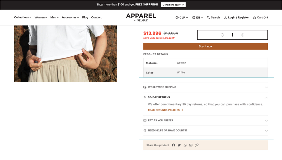
An Accordion is a section that can contain several “Items”, which are composed of basically four elements: Icon, Title, Text and Link; where the first and last ones are optional.
When a customer arrives at a product page, all of the Accordion Items will be closed/collapsed and customers can click on the item title to see the content that’s inside each one. Items come collapsed by default in order to not make the Product page too long in case the Accordion content is very extensive.
You can add a maximum of 4 Accordion items, but this can be extended by defining that some Custom Fields display within this section instead of its own default table list.
The options for you to customize how this section works are the following:
Enable Accordion
Allows to show or hide the Accordion section for all the products of your store.
Enable Icons
Allows to display an icon at the left side of each accordion item title.
Icons style
Allows to define the style of the icons.
Options for each Accordion Item
The options available for each Item are the following:
Enable Item X
Allows to show or hide the respective accordion item.
Item X - Icon
Allows to select an icon for the respective accordion item.
Item X - Title
Mandatory. Title of the respective accordion item. Ideally short.
Item X - Text
Text that displays after the title and inside the respective accordion item.
Item X - Link
Allows to choose any content of the store, like categories, pages, products, external links, etc. If empty, no link will be displayed.
Item X - Link Text
Text that displays in the link.
Accordion Items through Custom Fields considerations
For all the Accordion Items that are added through Custom Fields the following must be considered:
- The Title of the
itemwill be the name of the custom field, also referred to in the administration panel asLabel. - The Text of the
itemwill be the content you add on the custom field, also referred to in the administration panel asValue. - The Icon of the
itemwill be the one defined at the Product Page - Custom Fields section. - No link will be available for these items, unless you have basic
HTMLknowledge in order to add anatag to create a link. You can see some useful tips for how to achieve this at the Tips & Tricks page.
Product Page - Recommended Products
Recommended Products is a feature from Jumpseller that displays a collection of randomly selected products based on several information about the products you have added to your store. All this information is gathered and collected from the names, descriptions and other information you might add and relate them to show similar products customers might be interested in. You can read more about how this works in the following Jumpseller article.
The options available to customize this section are the following:
Enable Section
If enabled, a collection of randomly selected products (maximum 40) will be displayed.
Background Color
Background color of the section.
Products limit
Limit the amount of products that the section will display.
Enable Autoplay
If enabled, products will pass automatically from one to the next based on the speed defined in the option below.
Carousel speed
Time that takes to pass from one product to the next, in seconds.
Product Page - Frequently Bought Together
This section works by collecting information about the purchases that are being made in your store in order to detect which products are being purchased together, hence the name, Frequently Bought Together. It can display a maximum number of 4 collections or packs, with a maximum number of 4 combined products for each one, considering the product that’s being visited. You can read more about how this section works in the following Jumpseller article.
The options available to customize this section are the following:
Enable Section
If enabled, this will display after the product page main section.
Background Color
Background color of the section.
Number of Frequently Bought Together packs to show
Allows to choose how many packs will be displayed. Packs are sets or groups of frequently bought together products, including the product being visited.
Enable Autoplay
If enabled, Packs will pass automatically from one to the next based on the speed defined in the option below.
Enable Arrows
Displays next and previous arrows for customers to navigate the carousel.
Enable Dots
Displays dots (points) for customers to navigate and choose products to see.
Carousel speed
Time that takes to pass from one Pack to the next, in seconds.
Product Reviews
This section allows to enable the Product Reviews for all the products of your store, in the case they have been added by customers after they have made a purchase. There are some considerations and functionalities that have to be in place in order for this to work:
Reviews email
You must enable the Reviews Email in Settings > General > Emails > Product Review. There you can configure certain aspects of how this will work.
Approved reviews
There has to be at least one review on any of your products in order for the reviews and ratings to appear in a product page and/or in a product block view. To check the reviews customers have already made you can go to Products > Reviews and see the full list of reviews.
Jumpseller Plan
Product Reviews are only available for the Pro Plan or higher. So if you have the Plus or Basic plan at your store, even when this option is enabled, reviews won’t be displayed at all.
If you want or need more information about this, you can read the Product Reviews support article or the Customer Reviews article that explains how it can be beneficial for your store.
The options available for you to customize the Product Reviews section are the following:Enable Reviews
If enabled, a section in the product page will be displayed that will show customers the reviews provided by other customers for each specific product.
Display on Product blocks
Allows to display the average reviews rating as well as the stars icons on the product blocks view, like in the home page, category pages, search page.
Reviews Position
Allows to choose the position where Reviews will be displayed on the Product page:
- After the Main section: Reviews will be displayed just after the main product page section and even, before the
Componentsif added. - At the end of the page: Reviews will be displayed at the end of the
product page, afterComponents,Related productsor any other content that’s visible in the page.
Reviews on view
Carousel for the sake of usability, especially in Mobile devices. Here, you can set the amount of reviews that will be displayed on Desktop devices. For Tablets will always display two (2) reviews and for Mobile just one (1) review.
Enable Autoplay
If enabled, reviews will pass automatically from one to the next based on the speed defined in the option below.
Carousel speed
Time that takes to pass from one review to the next, in seconds.
Default Pages
Here you can configure and modify the structure and layout of the pages of your store that use the Default page template.
Components Position
Allows to define the position in which Components will display on pages that have the Default template applied:
- End of the page: Components will be displayed after all the content of the page, even after the “Contact Section” if it's enabled.
- Body of the page: Components will be displayed just after the content of the page and before the “Contact Section”, if enabled.
Enable Contact Section
Enables a section on the right side of pages with the Contact Information and Other interest links subsections. If disabled, the content of the page will be placed at the center of the page.
Enable Contact Section in Contact page
This section is available as well at the Contact page of your store. You can define to display (default) or hide it. If hidden, the Contact Form will take 100% of the available width of the page.
Enable Contact Information
Enables a section with the contact details you can add at Themes > Visual Editor > Edit Settings > Store Information.
Contact Information - Title
Title that displays in the Contact Information section. By default the text “Customer Support” will be displayed, which you can change at the Languages settings of your store or by filling this field.
Contact Information - Description
Enable Other interest links
Enables a section with links to store pages that you can add at Customization > Navigation > Other interest links. For this section to show, you need to add at least one item to the navigation list.
Other interest links - Title
Title that displays in the Other interest links section. By default the text "Other interest links" will be displayed, which you can change at the Languages settings of your store or by filling this field.
Other interest links - Description
Optional. Description that displays below the title of the Other interest links section.
Contact Page
- Live examples:
- Contact Page Example
Here you can edit the information that's displayed at the Contact page of your store.
Contact Page - Title
Title of the Contact page. By default the text “Contact us” will be displayed, which you can change at the Languages settings of your store or by filling this field.
Contact Page - Description
Description that goes below the title. By default a standard text will be displayed, which you can change at the Languages settings of your store or by filling this field.
Blog and Articles
- Live examples:
- Blog Page example
- Blog Article example
Here you can configure how the Blog of your store works, as well as the Articles (posts) pages.
Blog Page
Choose the “Page” that will be used as the main one for the Blog of your store. By default is the one that comes automatically created on your store: Blog.
Blog Posts category
Choose the Page category name that will be used to group all articles. By default Post will be used, which also comes automatically created.
Article Block > Amount per page
Allows to select how many Articles will be displayed per page in the Blog page, with a maximum amount of 40.
For example, if you have 40 articles on your Blog and define that 20 articles will be displayed per page, this will result in two pages with 20 articles each. The Pagination section will be displayed at the end of each page.
Article Block > Amount per row
Allows to select how many Articles per horizontal row will be displayed in the Blog page on Desktop devices. For Tablets there will always be two and for Mobiles one.
Article Block > Image Display
How the Article image will be displayed:
Resize
The original image will adapt to the available space.
Crop
Fills the image available space with the majority of the article's original image content.
Original
The image will be displayed with the dimension it was originally uploaded to the article. If you select this option you need to consider that as the images will be considerably big, this can have a negative impact on the performance of your pages loading speed.
You can find the proper dimensions details on which images will be displayed at the Theme Basics - Blog section of this documentation.
Article Block > Link Style
Allows to define the style of the Link (button) for all Article Block views:
- Filled Button: Buttons will have the default style like any other.
- Bordered Button: Buttons will have a border and its background will be transparent.
- Normal Link: The button will look like a normal link with a border at the bottom.
- Don't display Link: Link will not be visible, but the post image and title will be clickable so customers can go and read the article.
Article Block > Enable Link Arrow
Displays a right arrow inside the link (button).
Article > Display date
Allow you to select the format in which the Article date will be displayed or if you don't want to show it. This applies for both the Article page and the Article Block:
- Year / Month / Day
- Day / Month / Year
- Don’t display date
Article Page > Heading Width
Allows to define the width of the heading of the Article page:
Browser Width
Will be 100% of the browser's width. You must consider the maximum width defined in Themes > Visual Editor > Edit Settings > Theme Styles.
Grid Width
The width will be based on the Store's Grid width, which is approximately 1300px.
Article Page > Overlay color
Allows to define the background color for the Overlay element.
Article Page > Enable Breadcrumbs
Allows to show or hide the Breadcrumbs section which tells customers from which page they came before landing on the current page. It will display before the Article heading section.
Customer Pages - Forms
- Live examples:
- Login Page Example
- Registration Page Example
This section allows you to customize most of the sections for the Customer pages and its sections that were detailed and explain the Theme Basics - Customers section of this documentation.
For a better understanding of the options you will find next, it’s good to know that the Login and Create Account (or Register) pages are both divided into two sections, one positioned on the left side (referred as Left section) which contains the respective form, while the one on the right (referred as Right section) displays other type of information. In the case of the Create Account page, the right section can be enabled or disabled.
Page Logo
Allows to upload and display a Logo at the top of the left-hand section for pages with a Form.
Page Logo Height
Allows to define the height for the Logo.
Customize Colors
If enabled, you will be able to customize the colors with the options you see below. If not enabled, it will consider the colors defined in Themes > Visual Editor > Edit Settings > Theme Colors.
Left section - Background color
Background color for the section. This will be visible if no background image is added.
Left section - Form background color
Background color for the customer pages forms. This background color allows to generate contrast with the background of the section (image or color).
Left section - Form border color
Color of the border of the customer pages forms. If you don't need it, you can set its opacity to zero.
Left section - Form texts color
Color for the texts for the customer pages forms.
Left Section - Form Button > Text Color
Color for the text of the Button for all the customer pages forms.
Left Section - Form Button > Text Color (hover)
Color for the text of the Button for all the customer pages forms on hover state (when passing the mouse over the button).
Left Section - Form Button > Background Color
Color of the background of the Button for all the customer pages forms.
Left Section - Form Button > Background Color (hover)
Color of the background of the Button for all the customer pages forms on hover state (when passing the mouse over the button).
Left section - Background image (mobile)
Allow you to upload an image that displays at the background of the section for Mobile devices.
- Maximum recommended width: 575px.
- Recommended format:
.jpg, optimized for websites.
This image will be applied in both the Login and Create Account pages.
Left section - Background image (desktop)
Allow you to upload an image that displays at the background of the section for Desktop devices.
- Minimum recommended width: 1400px.
- Recommended format:
.jpg, optimized for websites.
This image will be applied in both the Login and Create Account pages.
Left section - Overlay color
Background color of the Overlay element that will display if you upload any available background images.
Right section - Background color
Background color for the section that is on the right side and that displays variable content depending on the page the customer is at:
- For the
Loginpage it will display content suggesting customers to create an account if they still haven't. - For the
Create Accountpage it can display information and content focused on letting customers know theBenefitsof creating an account.
Right section - Title and Text color
Color for the Title and Description of the right section.
Right section - Icons colors
Color for the icons that are visible on the Create Account page, on the right-hand section.
Right Section - Button > Text Color
Color for the text of the Button that's on the right section.
Right Section - Button > Text Color (hover)
Color for the text of the Button that's on the right section on hover state (when passing the mouse over the button).
Right Section - Button > Background Color
Color of the background of the Button that's on the right section.
Right Section - Button > Background Color (hover)
Color of the background of the Button that's on the right section on hover state (when passing the mouse over the button).
Customer Pages - Create Account Benefits
- Live examples:
- Account Benefits example
The options you will find here allow you to customize the section and information that’s available to be enabled at the Create Account page, at the right side of it.
This section it’s optional and its main focus is to let customers know or inform about the benefits of creating an account in your store. It comes with already predefined texts intended for that, but in reality, you can use it for any purpose you feel it can be used for. You may as well disable it if you think it’s not necessary.
The options available for this section are the following:
Enable Benefits section
If enabled (default), a Title and four (4) Benefits will be displayed at the right-hand part of the page. If disabled, the left-hand section that contains the Create Account form will take the whole width of the page.
Benefits section - Enable icons
Allows to show or hide the icons that are available to be displayed with each text.
Benefits section - Icons style
Allows to define the style of the icons.
Benefits section - Title
Allow you to replace the default title that this section displays, by filling this field or at the Languages settings of your store.
Benefits section - Disclaimer text
If enabled (default), a text will be displayed at the end of the page, after all the benefits. Its focus is to ensure customers that their information it's safe and secure. You can change it on the Languages section of your store's Admin.
Benefits Blocks options
Apart from the Title and Disclaimer text, this section allows to display up to 4 subsections that include the following options for each one:
Enable Benefit #X
Allow you to show (default) or completely hide the Benefit subsection.
Benefit #X - Icon
Icon for the Benefit subsection.
Benefit #1 - Text
You can replace here the default text for the Benefit subsection or go to the Languages settings of your store's Admin to do so.
